Monday, 10 December 2007

Friday, 7 December 2007

Well Done

Hey guys, just to echo dan's words, well done.
we all worked really hard, and i think we all done really well.


ill put on final screenshots etc. tmrw..

Thursday, 6 December 2007

Finito

Well done guys, we all worked really hard, and I really enjoyed working with you all.

Wack on any remaining work onto the blog, just so we have it as a reference at a later date.

Dan

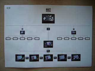
The final map

Wednesday, 5 December 2007


Layout ideas for presentation boards, with the images flush across the bottom of the grid and the copy at the top under the title. This leaves a big amount of white space, therefore creating our letterbox shape used throughout our project. Let me know your thoughts?!

Student bin, myspace

landscape/ final outline for site map

links and sound

ive just added the final links and sounds to the site, so we're nearly there..

links and sound

ive just added the final links and sounds to the site, so we're nearly there..

Tuesday, 4 December 2007

Site map

draft for our presentation board

idea's for presentation boards

Ideas for presentation boards

Here are different ways others have presented their work. We should keep to the same style as the rest of the site.
i.e. photos of pavement and rubbish/ paper.

Monday, 3 December 2007


A couple ideas for the presentation boards.
Remember Jon's lecture on the DVD menus, how the best ones fitted into context of what the film was about. Well I was thinking that as our main point behind the website is about the population and 'immigration' of bins, we could lay out our presentation boards like a Census form, or an immigration card. What you guys think?


Just whacking on some of my sketches for grids

Sunday, 2 December 2007

The two bin watercolours

illustration ideas

general notification

dan and i took the stop-frame photos yesterday, and i've looked at them on-screen and put them together and i reckon they look okay.

all we need now is the other pages (HISTORY, STATISTICS, CONTENTS), and we'll take those photos tomorrow, and start making the site tomorrow.

we also need to do sound effects, so while two of us are building the site, the other two can do the sounds..

Saturday, 1 December 2007


Zoomed in map

Friday, 30 November 2007

test stop-frames in their context


polaroid pics

these are the 4 pictures for the galleries page..

i don't know whats wrong with the colours on screen, but they are fine in real life..honest

Thursday, 29 November 2007

Quick thumbnails for data pages

To keep in theme/layout with the rest of the site...the last one could be the best option????????

Maps


Maps I've done on illustrator, all the bins in Nottingham City Centre

Posh Bin Silhouette background

Wednesday, 28 November 2007

O yeah here are the images that could be used


These our the other 3 bins


Just line drawing (not been used in photoshop yet)

smoking bin

A style we might be able to use????

MP3s

i managed to get the sound files converted to mp3, but for some reason i can't post them..

Web Design book - scans

scans from the Web Design book.
Possible inspiration for page layout and composition..

Tuesday, 27 November 2007

And another


Same principle but was aimed at kids to help them understand how to recycle. You throw the rubbish into the choice of bins. What rubbish goes in which bin?

What a rubbish game


An idea for a relevant game to be put onto the site, inspired by The Good Food Fight site

Chewing Gum

One of my ideas for the play of chewing gum on the site using stop frame motion.


I found a cool site which allows the audience to really interact with the site, like a game
The visual effect with this site is the food being thrown at the audience and splattering on the screen. So I thought maybe the bin could throw its rubbish back at you after you have just thrown the rubbish into the bin. Like the bin has a character 'it doesnt want your crap.'


Barbara's Ex


This is one of the sketches I did for the first idea 'Creature Comforts' this was originally aimed at a much younger audience. However adding the voice (of a foul mouthed but humorous character) would have aimed it at a teen/adult audience.

For our Red (posh/lady bin)

Rough layouts of what the site might look like.

Mark making


Experimenting with different mark making techniques... print (to create a urban feel)